Last Updated on March 17, 2026 by Sky Bloom IT
Article summary: Colour is the most overlooked element in hat buying. Most people pick a hat they like the look of and then discover it sits awkwardly against half their wardrobe. This guide covers how colour theory applies specifically to headwear: neutrals, undertones, contrast, and the specific shades that earn the most use across the widest range of outfits.
Most people buy a hat in the colour they find most appealing in the moment. This is a reasonable approach for a scarf or a pair of socks. For a hat, which frames the face and sits above the entire outfit, it is the approach most likely to produce something that clashes with half your wardrobe and sits unworn for most of the year.
Colour choice in headwear matters more than in almost any other accessory category. Understanding a few simple principles before you buy makes the difference between a hat you reach for every week and one that earns a single outing before returning to the shelf.
Why the Colour of a Hat Matters More Than Any Other Accessory
A hat sits at the highest visible point of an outfit and frames the face directly. It interacts simultaneously with your skin tone, your hair colour, and the dominant tones in your clothing. No other accessory does all three at once. Getting the colour right is less about rules and more about understanding three things: how neutrals behave, how undertones affect the face, and how contrast works within an outfit.
The Case for Starting With Neutrals
Neutral hats are not a compromise. They are the foundation of a hat wardrobe that earns consistent use.
Camel, warm grey, chocolate brown, off-white, navy, and charcoal are the neutrals that perform most reliably across the widest range of skin tones, hair colours, and wardrobe palettes. Each is specific enough to add character to an outfit while remaining flexible enough not to conflict with the colours already in the wardrobe.
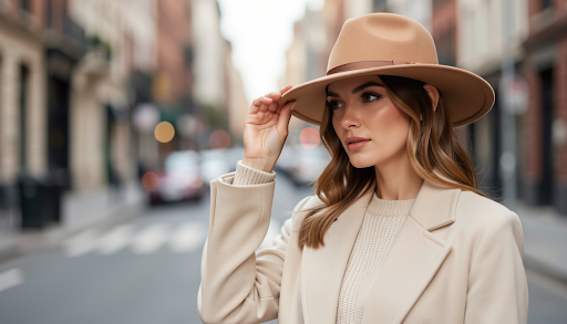
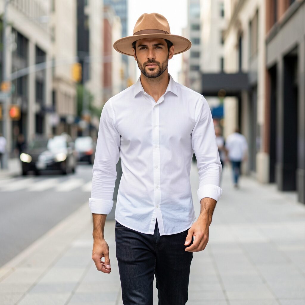
Camel is the single most versatile hat colour available. It works across cool and warm skin tones, reads as seasonal across spring through autumn, and connects naturally to a warm neutral wardrobe without competing with bolder colours in the outfit. A camel fedora worn with dark jeans, a white shirt, and tan boots draws the colours of the outfit upward in a way that photographs well and wears well all day.
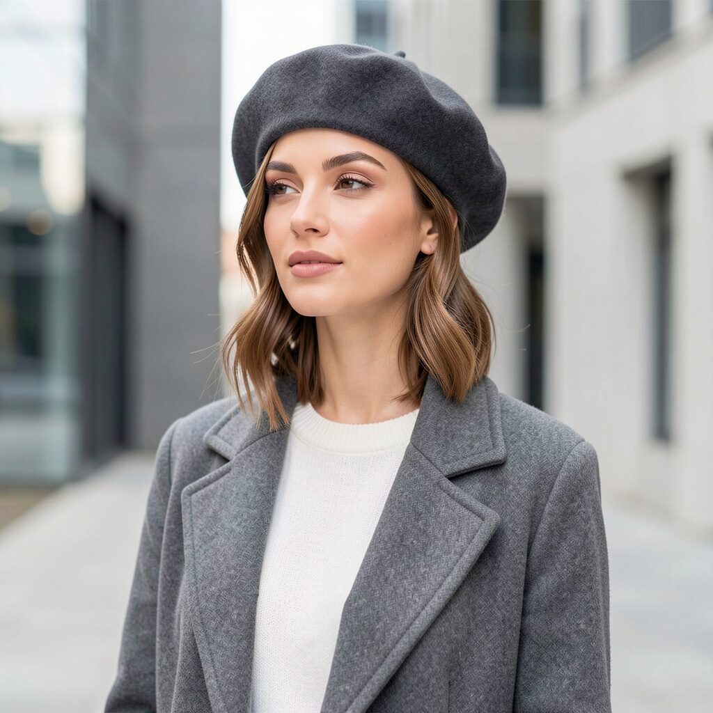
Charcoal and navy perform the same function at the darker end of the palette. Both anchor an outfit without demanding attention and work particularly well against lighter clothing where a black hat might read as too heavy.
Pure black and pure white deserve more care. Black can read heavily against warm or olive skin tones; charcoal does the same job with more warmth. Pure white washes out pale complexions and is harder to keep clean. Off-white or ivory does the same visual job with more forgiveness.
How Warm and Cool Undertones Affect Which Hat Colours Work for You
Every hat colour carries an undertone that pulls it toward warmth or coolness. A grey hat can be warm (stone, taupe) or cool (blue-grey, silver). Brown can be warm (caramel, tobacco) or cool (muted, ash-inflected). Warm undertones tend to sit better on warm or olive complexions and alongside earth-tone wardrobes. Cool undertones work more naturally on cooler complexions with wardrobes in grey, white, and dusty tones. The practical check: hold the hat in natural light next to your face and notice whether the warmth or coolness of its tone feels settled or slightly off.
How Contrast Works and When to Use It
Contrast is one of the most reliable ways to make a hat feel deliberate. A white hat against a dark navy outfit draws the eye upward. The tonal relationship is softer when a camel hat is worn against cream. A burgundy or deep green hat against a neutral grey adds a personality note without disrupting the balance of everything else.
What does not work is tonal sameness at a similar depth. A medium brown hat against a medium brown coat tends to disappear entirely. The simplest rule: if the outfit is predominantly dark, choose a hat a shade or two lighter. If the outfit is light, a slightly deeper hat earns its place.
Colour Experimentation Without the Risk
Once a neutral base is in place, colour becomes genuinely rewarding. Dusty rose, sage green, mustard, cobalt, and deep burgundy all work when the outfit underneath is restrained. A mustard fedora with dark jeans, a cream knit, and white trainers: the hat carries all the colour, and the outfit frames it. A sage green beret with a camel coat and a white roll-neck: the beret is the single colour note in an otherwise tonal look.
Structured styles carry colour most effectively. Fedoras, berets, and flat caps in quality wool felt hold colour with a richness that lightweight or synthetic materials cannot replicate. The women’s fedora hats collection includes seasonal, coloured felt styles that demonstrate exactly how a well-chosen hat colour works against a considered outfit.
Hat Colours That Work Best for Each Season
Hat colour also shifts naturally with the seasons. Lighter shades such as ivory, camel, sage, and soft pastels work particularly well in spring and summer wardrobes where fabrics are lighter and colours brighter. Autumn and winter outfits benefit from deeper tones such as charcoal, chocolate brown, forest green, and burgundy, which complement heavier fabrics like wool, tweed, and denim. Choosing seasonal colour depth helps a hat feel naturally integrated with the rest of the wardrobe rather than visually separate from it.
The Two-Hat Colour Foundation Worth Building
Two hats in well-chosen colours cover the vast majority of occasions and outfits. The first is a neutral in the warm family: camel, warm grey, or chocolate brown. It earns its use across autumn, winter, and spring with almost any outfit. The second is a deliberate colour or contrast piece: burgundy, cobalt, forest green, or dusty rose. It provides the accent that a wardrobe of neutrals cannot always supply on its own.
Two hats chosen with intention earn more use than a shelf full bought on visual impulse. For flat cap styles across neutral and seasonal colour options in quality woven fabrics, the Harris Tweed flat caps collection covers the heritage palette with colourways worth exploring.
Frequently Asked Questions
What is the most versatile hat colour to buy first?
Camel. It works across warm and cool skin tones, reads well across multiple seasons, and connects naturally to the warm neutrals that appear in most wardrobes. Warm grey and chocolate brown are close alternatives with slightly different tonal relationships.
Can you wear a bold-coloured hat with a patterned outfit?
Yes, with one rule: the hat colour should echo a recessive or background tone in the pattern rather than competing with its dominant colour. A floral with navy, blush, and white: a navy hat anchors the look by pulling from the background. A blush hat amplifies the dominant tone and can overwhelm, depending on the scale of the print.
What is the easiest way to choose the right hat colour for an outfit?
Colour is not complicated when the underlying logic is clear. Start with a neutral that works with your skin tone and wardrobe undertones, understand how contrast creates definition, and add colour deliberately once the foundation is established. Every perfect hat outfit starts with those decisions made before the hat goes on.